
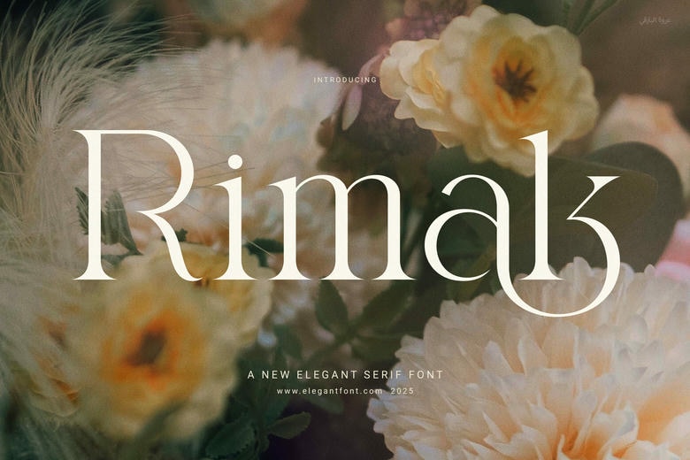
Rimak Elegant Serif Font is a combination of classic and contemporary elegance in a single elegant typeface. Rimak is designed with the perfect proportions of balance and gives a clean and graceful serif appearance that immediately uplifts any design. This font will give you a high-end, professional look whether you are designing on digital or printed media.
At the initial sight, Rimak draws the eye with its smooth, uniform letterforms and practical ligatures. Such ligatures not only contribute to the visual flow of text but also provide a unique appeal to every design. Due to its sleek and elegant feel, Rimak can be used in a range of projects – particularly those that require a touch of class and modernity.
Besides being aesthetically pleasing, Rimak is user-friendly. It is also readable in all sizes and this makes it a good option in both headlines and long text. Whether you’re developing a bold brand identity or laying out editorial content, this font adapts easily to your needs.
Rimak Font is available for free download for PERSONAL USE. Link to purchase full version and commercial license: HERE
Rimak Serif Font


License: Personal Use Only!
Font Type: Free
Format: TTF
Total Files: 1


Nice font share. Rimak looks clean and elegant, especially for headings, branding, and editorial-style layouts. I also like that the post mentions readability, because some decorative fonts look beautiful in previews but become hard to read in real designs.
For quick social media testing, I also compare stylish text styles http://letrasbonitashub.com/ before choosing a final look.
I agree. Link styling has a bigger impact on usability than many people realize. When links don’t stand out clearly, users can easily overlook important information, especially in long knowledge base articles. Having a global setting for the default link color, underline, and font weight would help maintain consistency and improve accessibility.
It’s similar to how Unicode text tools let you preview different text styles before using them. For example, I sometimes check different text styles on https://letrasbonitas.com.es/ to compare readability, but for documentation I always prefer styles that are clean and easy to recognize.
Great font choice. Rimak has a really clean and elegant vibe, making it ideal for headings, branding, and editorial layouts. I also appreciate that the post highlights readability—some decorative fonts look stunning in previews, but end up being tough to read in actual designs.
For quick social media testing, I also test out different styles on http://ailetrasbonitas.com/ before deciding on the final look.
Rimak has a really elegant and balanced look. I especially like how the serif details make it suitable for headings, branding, and editorial designs while keeping the text readable. For anyone experimenting with different typography styles online, https://letrasbonitos.com/ is also a useful place to explore stylish text and Unicode lettering for creative headings, profiles, and social media content.
I appreciate how you’ve highlighted the balance and clean appearance of the Rimak font. It sounds like it would be fantastic for projects needing a professional touch. For those looking to experiment with text in different ways, I found a helpful font curve generator that lets you place text on various paths.
Rimak looks really elegant, especially for headings, branding, and editorial designs. I like that it manages to keep the decorative feel while remaining readable.
When testing different lettering styles for social media or creative projects, I also like experimenting with Letras Bonitas to compare different text styles before deciding which look works best.
Rimak looks really elegant, especially for headings, branding, and editorial designs. I like that it manages to keep the decorative feel while remaining readable.
When testing different lettering styles for social media or creative projects, I also like experimenting with https://ailetrasbonitas.org/ to compare different text styles before deciding which look works best.
Qué fuente tan elegante y versátil! La estética de la tipografía Rimak es ideal para proyectos de diseño visual y marcas modernas. Al organizar diarios de diseño gráfico o estructurar listas de recursos tipográficos, mantener un formato visual limpio ayuda a catalogar estilos rápidamente. Si buscan una herramienta web rápida para probar y generar estilos Unicode directamente en sus planificadores digitales o biografías, les sugiero visitar conversor de letras. ¡Excelente aporte tipográfico
Rimak Elegant Serif Font is a beautiful choice for anyone looking to add a refined and luxurious touch to their designs. Its classic serif style combined with modern proportions creates a polished look that works perfectly for branding, invitations, editorial designs, and more. For more stylish typography inspiration, check out these letras bonitas: https://fontedeletra.com/letras-diferentes/letras-bonitas/